 &
&  to life
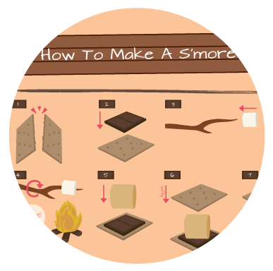
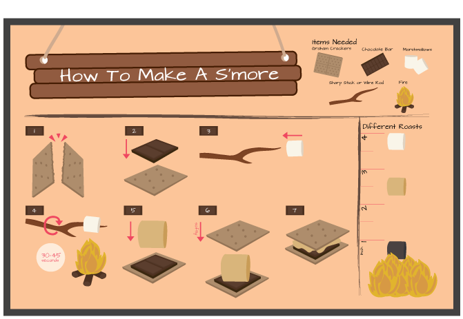
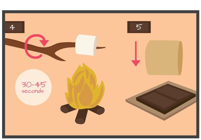
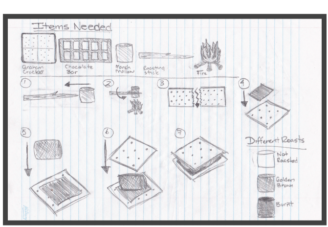
Design a set of visual instructions to explain how to complete a task.
By using minimal words, minimal steps and using simple graphics to explain how to make a s'more, while keeping it clean, to the point and organized with no unnecessary decorations or information. Making it visually interesting for the viewer through the use of color and illustration. Creating an overall feeling of camping and being outdoors.
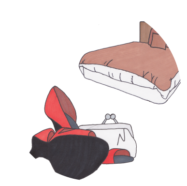
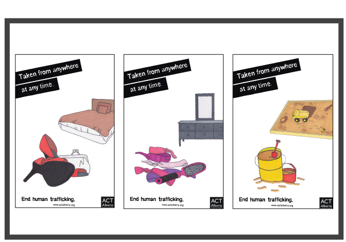
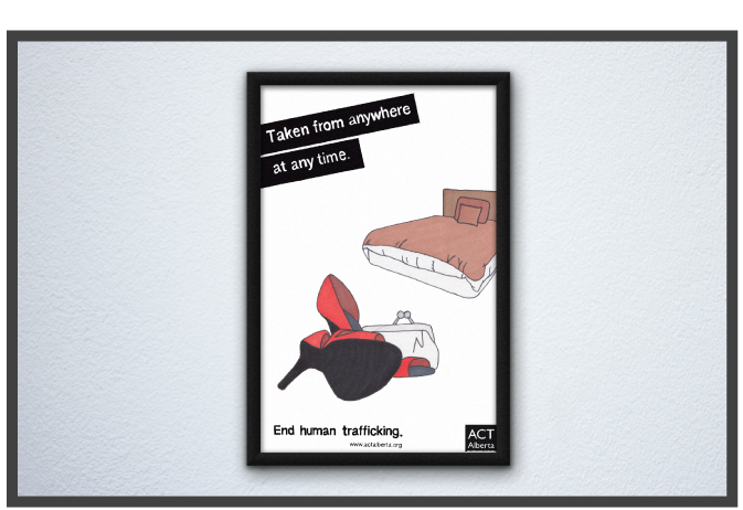
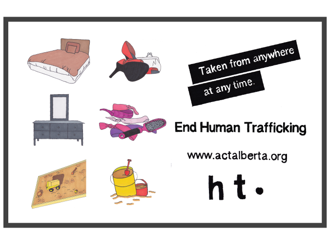
Develop and design a campaign series that is made up of three separate advertisements.
Taking a different approach on a social awareness campaign and using different illustrations and hand rendered text to target a younger audience and grab their attention to the posters. The posters are intended to inform the public and teach them the signs so they can help themselves or others who are at risk or already involved.
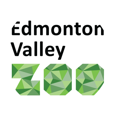
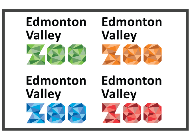
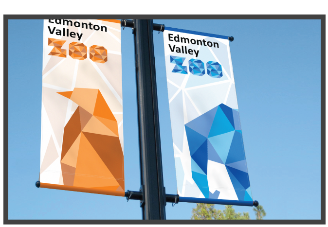
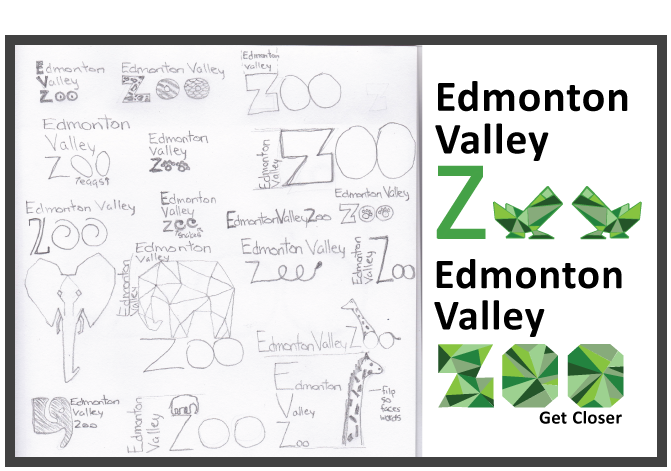
Rebrand the Edmonton Valley Zoo identity.
A signature was created that is vibrant, geometric and modern. The signature uses bold, bright colors to grab the view’s attention. The four colors used: green, orange, blue and red represent the different animal species at the zoo. The colors are memorable and impactful. The geometric shapes bring a modern feel and represent a puzzle, bringing people and animals closer together.
Design a set of visual instructions to explain how to complete a task.
By using minimal words, minimal steps and using simple graphics to explain how to make a s'more, while keeping it clean, to the point and organized with no unnecessary decorations or information. Making it visually interesting for the viewer through the use of color and illustration. Creating an overall feeling of camping and being outdoors.
Develop and design a campaign series that is made up of three separate advertisements.
Taking a different approach on a social awareness campaign and using different illustrations and hand rendered text to target a younger audience and grab their attention to the posters. The posters are intended to inform the public and teach them the signs so they can help themselves or others who are at risk or already involved.
Rebrand the Edmonton Valley Zoo identity.
A signature was created that is vibrant, geometric and modern. The signature uses bold, bright colors to grab the view’s attention. The four colors used: green, orange, blue and red represent the different animal species at the zoo. The colors are memorable and impactful. The geometric shapes bring a modern feel and represent a puzzle, bringing people and animals closer together.
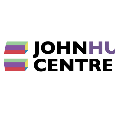
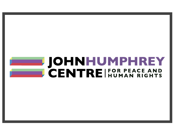
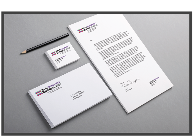
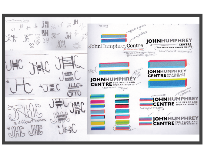
Choose a local non-profit organization and update their identity. Rebrand the company logo and apply it to a promotional kit.
The JHC’s main concepts of community collaborations, and education, which focuses on the celebration of differences and equality, could be visually represented through color and shape. After many iterations, a design was created that included a equal sign in many colors along with the name of the organization. JHC is about equality for all, which is why the equal sign is used. The equal sign is different colors to represent diversity and each color has a specific meaning.
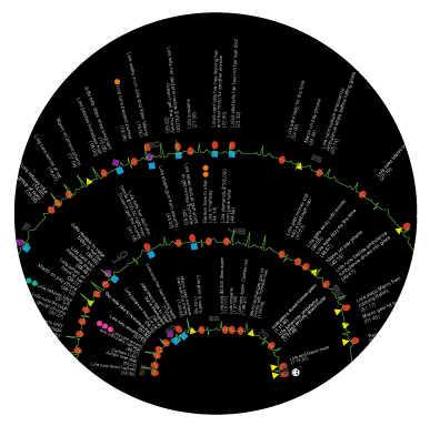
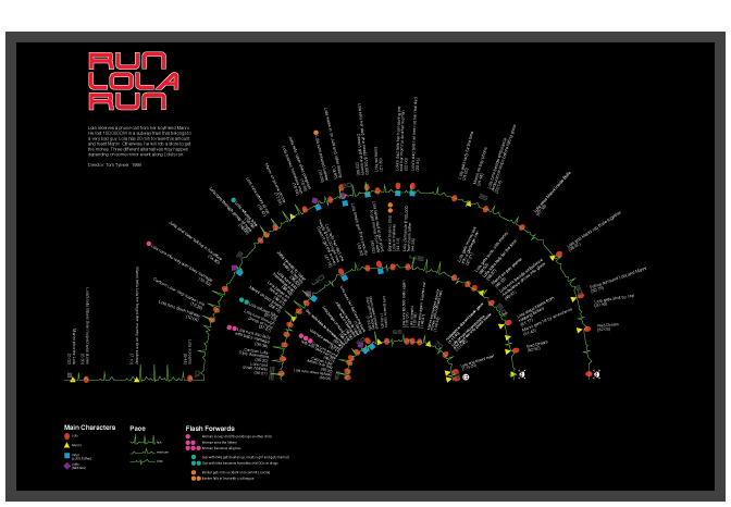
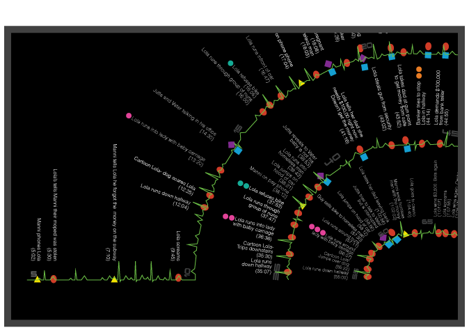
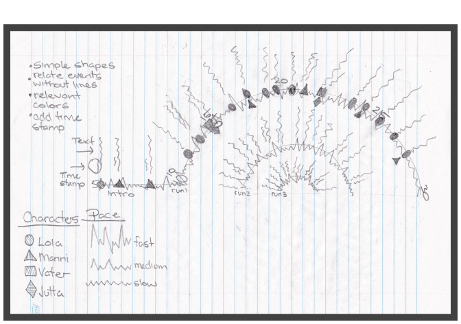
Make the invisible, visible. Watch Run Lola Run and collect information and great an infographic using the information collected
Collect information from the film, Run Lola Run, and make that information visually interesting with macro and micro information and using text, time stamps, characters, shapes and color.
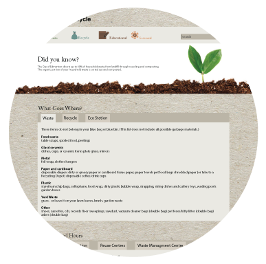
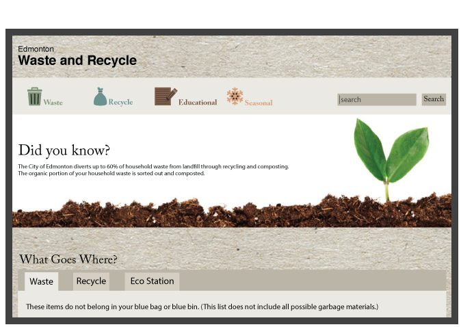
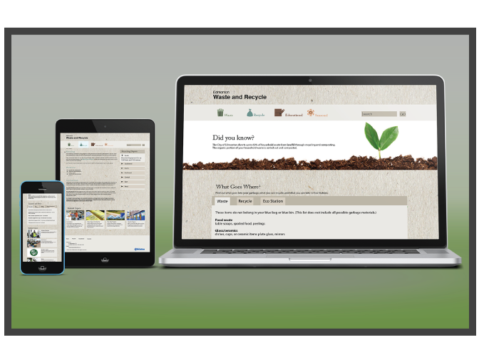
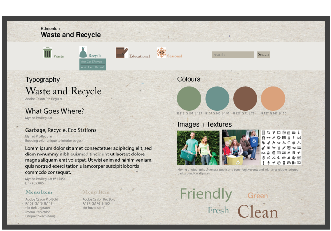
Redesign the city of Edmonton Waste and Recycle site to make it more user friendly and attractive.
Redesigning the city of Edmonton’s Waste and Recycle part of the website to make it more inviting, engaging and of course more user friendly. Keeping the information already provided and giving the site a fresh update.
Choose a local non-profit organization and update their identity. Rebrand the company logo and apply it to a promotional kit.
The JHC’s main concepts of community collaborations, and education, which focuses on the celebration of differences and equality, could be visually represented through color and shape. After many iterations, a design was created that included a equal sign in many colors along with the name of the organization. JHC is about equality for all, which is why the equal sign is used. The equal sign is different colors to represent diversity and each color has a specific meaning.
Make the invisible, visible. Watch Run Lola Run and collect information and great an infographic using the information collected
Collect information from the film, Run Lola Run, and make that information visually interesting with macro and micro information and using text, time stamps, characters, shapes and color.
Redesign the city of Edmonton Waste and Recycle site to make it more user friendly and attractive.
Redesigning the city of Edmonton’s Waste and Recycle part of the website to make it more inviting, engaging and of course more user friendly. Keeping the information already provided and giving the site a fresh update.
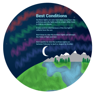
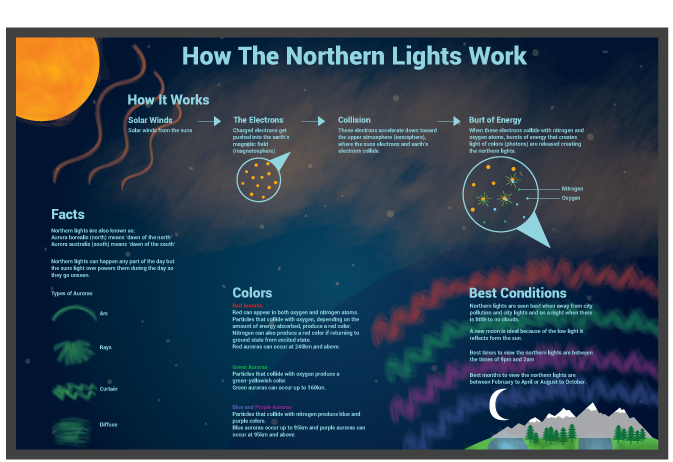
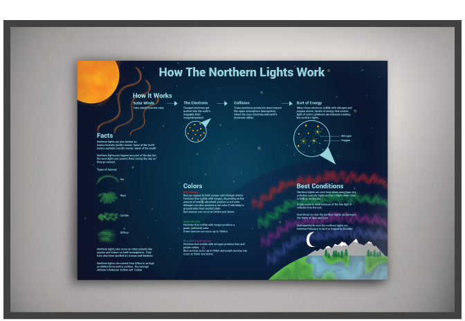
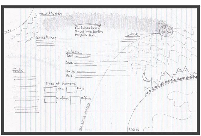
Choose a topic to research and make a diagram that shows the information in a sensible and visually interesting way.
Researching and collecting facts and data to create a visually interesting diagram of how the northern lights works. Making this a poster that would be seen in educational buildings such as school science labs.
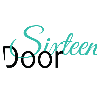
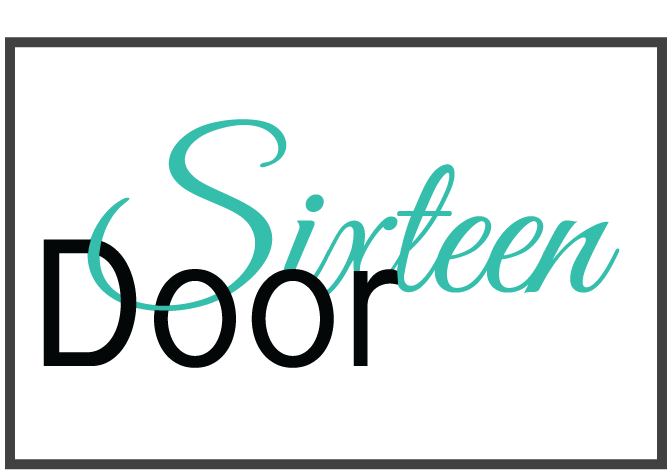
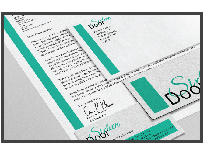
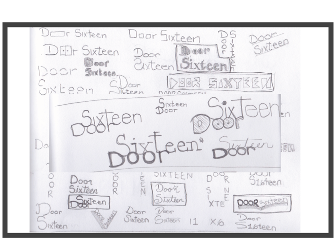
Create an identity for a fictional online magazine company and apply the identity to a promotional kit.
Door Sixteen is a fictional creative online magazine that focuses on inspiring people. The magazine features different artists and interesting articles every month. The word mark for Door Sixteen uses a simple sans-serif typeface, paired with a script typeface, which creates a professional yet creative and fun feel to the company. The word mark is flowing and light to give the feeling of welcoming and openness. The bottom of the S flows through the D and O to add ingenuity and visual interest. Door Sixteen is meant to inspire and encourage so the word mark is kept simple and clean, leaving the imagination to elaborate upon it.
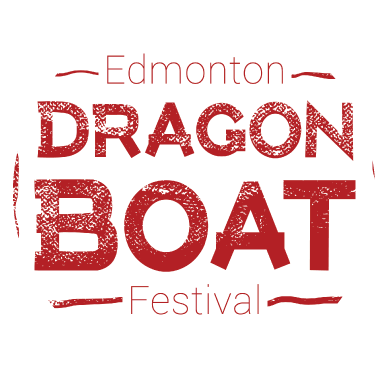
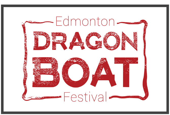
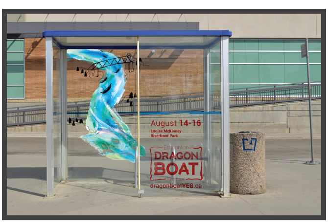
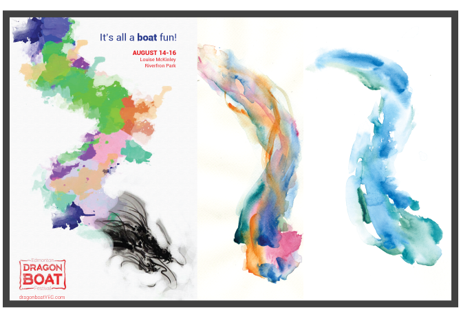
Choose a cultural event that takes place in Edmonton and create an advertising campaign for the event.
By adding a fresh, dynamic take on an ancient festival promotes it as more of an Edmonton based event. By leaning away from cliché, Asian themed imagery, the campaign celebrates the multicultural aspect of Edmonton and the recreational activity itself. The dragon body flows to mimic the river with accompanying trees from the river valley and the high-level bridge (an iconic symbol of Edmonton). The redesigned logo contains a subtle reference to a traditional Chinese stamp, but has been updated to look modern and clean. Not only does the watercolor treatment easily communicate the message of a river, but it also creates a lively and eye-catching texture that will grab the eye of the viewer and make them intrigued and excited to get involved. The advertising campaign keeps the designs looking fun, inviting, colorful and eye-catching.
Choose a topic to research and make a diagram that shows the information in a sensible and visually interesting way.
Researching and collecting facts and data to create a visually interesting diagram of how the northern lights works. Making this a poster that would be seen in educational buildings such as school science labs.
Create an identity for a fictional online magazine company and apply the identity to a promotional kit.
Door Sixteen is a fictional creative online magazine that focuses on inspiring people. The magazine features different artists and interesting articles every month. The word mark for Door Sixteen uses a simple sans-serif typeface, paired with a script typeface, which creates a professional yet creative and fun feel to the company. The word mark is flowing and light to give the feeling of welcoming and openness. The bottom of the S flows through the D and O to add ingenuity and visual interest. Door Sixteen is meant to inspire and encourage so the word mark is kept simple and clean, leaving the imagination to elaborate upon it.
Choose a cultural event that takes place in Edmonton and create an advertising campaign for the event.
By adding a fresh, dynamic take on an ancient festival promotes it as more of an Edmonton based event. By leaning away from cliché, Asian themed imagery, the campaign celebrates the multicultural aspect of Edmonton and the recreational activity itself. The dragon body flows to mimic the river with accompanying trees from the river valley and the high-level bridge (an iconic symbol of Edmonton). The redesigned logo contains a subtle reference to a traditional Chinese stamp, but has been updated to look modern and clean. Not only does the watercolor treatment easily communicate the message of a river, but it also creates a lively and eye-catching texture that will grab the eye of the viewer and make them intrigued and excited to get involved. The advertising campaign keeps the designs looking fun, inviting, colorful and eye-catching.